


WolfX2
-
Posts
374 -
Joined
-
Last visited
Content Type
Profiles
Forums
Events
Posts posted by WolfX2
-
-
lemme know what you think

no, "G.L.A.S.S." doesnt stand for anything
-
Other Gfx Tutorial Forum Posting Rules
This is just some guidelines on how to act when posting in the Gfx tutorials forum and what you should keep in mind. These rules are not a "suggestion"! They will be enforced by me and all other WinCert Mods/Admins!If you are writing a tutorial, please read on...
If you are requesting a tutorial, please scroll down to "Section 2: Requesting a Tutorial"
Section 1: Writing a Tutorial
Rule Number 1: Purpose
Graphics serve only one purpose, to ADVERTISE! If a graphic is not advertising something or is advertising something inappropriate for this forum, it has NO place anywhere here.
Rule Number 2: Titles
All tutorial titles should begin with "[How To]" and be labeled with this icon "
". Titles should be clearly marked and no title should be duplicated. Any posts with generic titles will be renamed. Double posts will be deleted!Rule Number 3: Image Screen Shots
When posting screenshots/images, make sure they do not exceed 300px*200px or provide a link to the image. Please try to avoid from uploading images to WinCert, use a free service like imageshack alternatively.
Rule Number 4: Less is Best
As
Simple
As
Possible
When writing a tutorial, try to get to the end in less than 10 steps. Filter through your tutorial before posting it, so only the necessary information is used. Please keep in mind you can post a maximum of ten images per post.
Rule Number 5: Effort is Appreciated
Please don't provide a link to a tutorial, actually copy and paste it into a new post. If you were not the creator of the tutorial, please give credit to the resource it originated from.
Section 2: Requesting a tutorial
Rule Number 1: Titles
All tutorial requests should begin with "[Request]" and be labeled with this icon "
".Titles should be clearly marked and no title should be duplicated. Any posts with generic titles will be renamed. Double posts will be deleted! Once Tutorial Requests have been answered the title beginning will be changed to "[How To]" and the post with the tutorial will be bumped up to the top, for convenience and easy readability.Rule Number 2: Tutorials Only
This is NOT the forum to request graphics in! Only graphics tutorials may be requested here. This forum is about LEARNING how to create graphics! Any graphic request topics will be closed and the user's warn levels increased.
Rule Number 3: New Idea=New Topic
Topics have titles for a reason, don't request multiple tutorials in a single topic. New Idea=New Topic.
Section 3: Wincert Forum Rules
The forum rules still apply, no matter what! Here is a link to them, just in case you cant find them!
-
Here's a real simple, quick and easy interface button you can make with PhotoFiltre. In order to complete this tutorial you will need the Gravure Filter and the RGB Fantasy Filter. You can download them both for free on the PhotoFiltre Web Site. Just click on the Plug-ins Link to the left. Once you have them installed you can access them from the Filter / Plug-in menu or your plug-in tool bar if you have them set up there. RGB Fantasy is a Plug-in I use quite often so you may want to download it even if this tutorial is of no interest to you.
1) Open up a new image 200 x 200 with a black background. 2) Select the Rectangle Tool a draw a 150 pixel wide x 40 pixel high rectangle.
Note: you may want to place it up to the top like mine
if you plan on making more than one button.
3) Menu = Filter / Color / Gradient Style = Duotone
Direction = Top to Bottom
Color 1 = RGB 255,255,255
Opacity = 100%
Color 2 = RGB 150,150,150
Opacity = 100%
4) Menu = Filter / Stylize / Progressive Contour
Width = 3
Color = RGB 0,0,0
Opacity = 100%
Effect = None
5) Menu = Selection / Contract Width = 10
6) Menu = Filter / Stylize / Progressive Contour
Width = 3
Color = RGB 0,0,0
Opacity = 100%
Effect = Blur
7) Menu = Selection / Expand Width = 10
8) Menu = Filter / Plug-in / Gravure
Select the Contours+ Tab
Setting = Diaphagme +1
9) Menu = Selection / Contract Width = 10
10) Menu = Filter / Visual effect / Gaussian Blur
Radius = 1 Pixel
11) Menu = Filter / Plug-in / RVB Fantasies
Select the RVB+ Tab and start playing around with the different color
Combinations until you find something you like.
Thanks to This Site
-
Who would win in a fight - a big, strong guy or an invisible fat guy?
-
Nope :clap:Hey Wolf you know the new Zelda Video Game has Link turning into a WolfYou a Zelda Fan?
and don't worry, i haven't forgotten about you, i've just been really busy, i'll make that logo as soon as i find some time
-
After a brief silence....were once again changing icons on the forums. So if things look a little weird for time being, don't worry, were working on it
...but if you just like to complain, you can send me an angry PM -
hahahhaaha
-
got a wolf one?
-
the patriot?
-
Planet of the apes :lol:but...yea, i have no idea
-
Great job with the slider buttons :clap:
if ya need any gfx for it...just ask
Moved To Windows Customization Forum
-
Great Job guys! I already have finalists in mind :bounce8: ..but theres still time
-
Sure! i found allot! go ahead! i cant wait
call it "other graphic software tutorials"one more forum to call my own
-
with all this vista someone has to throw in a mac....
my dektop
-
@Kelsenellenelvian - ok...but results wont be as nice..but i'll find something
@N1K - Thanks
-
*walks in on crutches* maybe i should get into webdesign insted
-
i made some mac folders...but i don't think i wanna share those...please don't beat me up
....no, seriously if you do I'll ban you :lol: -
-
hehe, there just pretty to look at
-
Up late at 11:19PM, when i should be sleeping because i have school tomorrow...i was thinking about kel's comment...
I couldent get this out of my head...so i did something about it!Personally I HATE the sideways folders...
'nways...here they are...hope you like, if you would like a custom made one , just replyChase:"House never gives speeches."House:"But when I really believe in something, gosh dang it, I gotta chance to make a difference here!"
-
:lol:
-
1.) Create a new document, 400x400 pixels). Reset your colours to the default settings (D), and use the Clouds Filter (Filter -> Render -> Clouds). Next, use the Radial Blur feature (Filter -> Blur -> Radial Blur). Put the settings as Zoom, 40, and Best.
2.) Next, do Bas Relief (Filter -> Sketch -> Bas Relief). Use the settings, Detail 7, Smoothness 15, Light : Top
Your image should be now looking something similar to this
3.) The next step is to duplicate the layer (Layer -> Duplicate Layer). Name this Layer 'Layer 2'. Now, reselect Layer 1. On Layer 1, use the Chrome tool (Filter -> Sketch -> Chrome) with settings Detail 0, Smoothness 10.
4.) Now, select the duplicate layer, and change the blending mode to Exclusion.
5.) Re-select Layer 1, and go to Image -> Adjustments -> Hue/Saturation.
Click the 'colorize' box in the bottom right hand corner of the Hue/Saturation window. Put the settings as follows, Hue : 211, Saturation : 28, Lightness : +10
6.) In order to make the next step easier, I strongly recommend zooming out to 50%. This is done by selecting the Zoom tool (Z), then zoom out by holding Alt and clicking on the image, or right-clicking then selecting 'Zoom out'.
In order to zoom out to 50%, do the step mentioned above twice.
7.) Now, press Ctrl+T (Transform). Right-Click and select 'Perspective'. Click, hold and drag the bottom-left marker out as far to the left as you can.
8.) Press 'Enter'. You are now finished
thanks to Phoenix_AO
Heres mine.....
no chnage, same steps
-
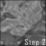
step1:
start out by creating a new document 300x300 (bigger if you want later on). hit 'd' to reset the colors! then select you Gradient Tool and use the settings i have below:
step2:
now with your Gradient Tool selected freely drag and click over your work area several times all in different directions! I'd say click and drag at least 30 times! Below is how it came out for me (each result will be different):
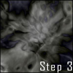
step 3:
now that you got you image looking a little something like the image above we need to duplicate the layer! to do this simply go to layer > duplicate. now with your new layer selected goto edit > transform > flip horizontal! then set the blend mode to overlay.
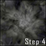
step 4:
now you should have 2layers. select the top layer and hit ctrl+u (to colorize) and use these settings:
hue: 0
saturation: 25
lightness: 0
be sure to have colorize box cked. you should get something like the image below:
optional step:
even tho step 4 was the last step you can get a different look from the same image! simply have the top layer selected and hit ctrl+i to invert the top layer! your results will look like the image below:
Thanks To Block9.net
Here's what happened when i tried...of course i make some changes, though
-
This is a unique tutorial because you will never get the same results two times in a row. So if you're not happy with your results, try again.
1. Start off by creating a new image of any size, just make sure it forms a perfect square. (I set my image size to 294x294.) Create a new layer, fill it in white, and go to Filter > Render > Difference Clouds.
2. Next go to Filter > Sketch > Chrome. Use the following settings: Detail: 3, Smoothness: 7.
3. Now repeat step one about two or three times or until you are satisifed. Then go to Filter > Distort > Pinch. I set the amount to 55%, but set it to whatever looks best.
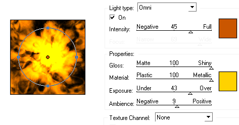
4. Now copy the current layer by dragging the layer to the new layer button and go to Edit > Transform > Rotate 90 degrees CW. Then change the layer opacity for the current layer to 50%, so the image underneath can be seen.
5. Let's make it look like a fire, so click on the top layer then click on the triangle next to the paths tab in the layers palette and select Merge Down. Then go to Image > Adjustments > Equalize. To get the fire effect go to Filter > Render > Lighting Effects. Use the settings in the image below.
thanks to block9.net
I did some changeing around, and this is what mine turned out like....


 ". Titles should be clearly marked and no title should be duplicated. Any posts with generic titles will be renamed. Double posts will be deleted!
 ".Titles should be clearly marked and no title should be duplicated. Any posts with generic titles will be renamed. Double posts will be deleted! Once Tutorial Requests have been answered the title beginning will be changed to "[How To]" and the post with the tutorial will be bumped up to the top, for convenience and easy readability.


Downloads from MS
in Software Field
Posted
Thats quite a nice list you got there :clap:
Moved to software field
Sticked