_14e30a.png)
_8126ce.png)

ianymaty
Members
-
Joined
-
Last visited
Everything posted by ianymaty
-
-
You crossed all the suggestions meaning it's implemented. Only the third is visible. Another unknowing question: As I see the taskbar button changes colour on different stages, you manipulate those colours or it's down to Windows, again? Was the coloured buttons before get rid of the Aero tools manager and Windows put the colours on the buttons?
-
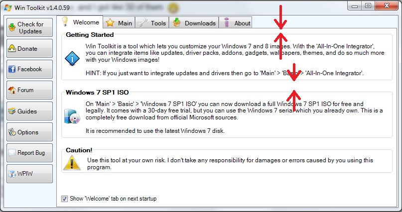
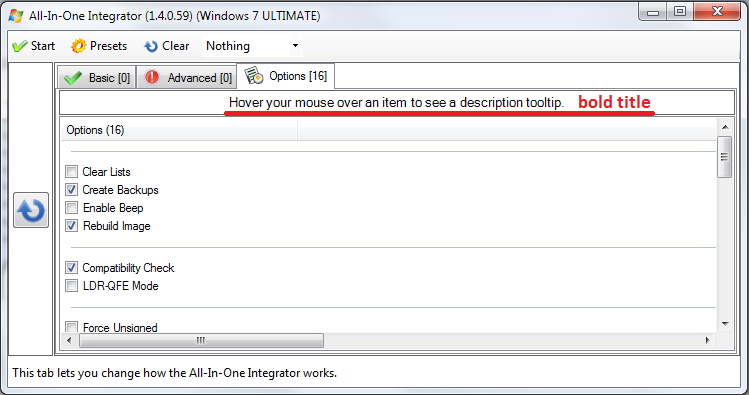
I agree too, the bold text on buttons didn't look so well because when mouse hovers the button the text wrap and behaves different on every button. So, it looks better without bold text = no wrap. Maybe a colour other than white will help more than the bold text to highlight the button. I remember once was a light blue, that looked cool, what happend with that? Two small sugestions: All-In-One\Options title - Hoover your mouse... make it bold too like the rest of the titles. On Welcome screen make the space between the tab buttons and Getting Started box = the space between the other boxes. And maybe a third suggestion - an (!) after Caution on Welcom screen?
-
Update Changelog offered again and again. The only item selected is Update Changelog in top of the list at New Updates. After download the only item selected is the same Update Changelog but at the bottom of Already Downloaded Updates.
-
Uff that Micros...t. The shades aren't so annoying but the buttons I think they are... I don't know how a button is constructed, just a thought. Can't you allocate 1/4 for icon and 3/4 for text? Or any proportion you want/need. If that's possible than you can center them more accurately. Just a thought anyway. New small bug or not! Go to About tab, don't click in the window just scrol with mouse wheel. Is it suppose to mark all the text from that window? Think not.
-
-
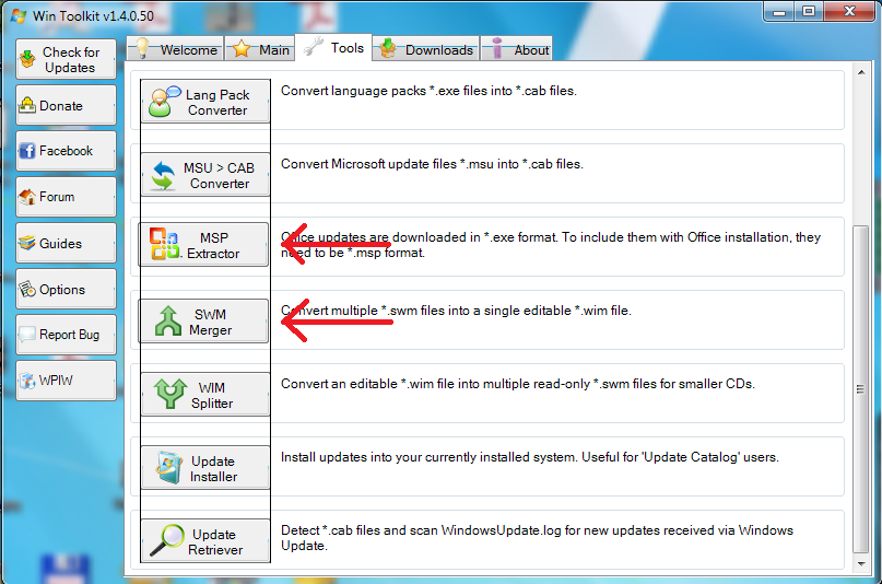
Two buttons a little bit off to the left on Tools tab. Bold the titles in Downloads tab too. (Main, Web Browsers, Misc) Icons on Welcome screen could be bigger like 2x the size of now. Windows 7 SP1 ISO's icon from Welcome and Main\Basic tab button should be the same for less confusing. I can understand that icon from Downloads tab can be other since it points to both Windows 7 and 8. I come back again on some buttons text. - Check for Updates seems to have more space between icon and text than others from the left side buttons that are all aligned to left. - The buttons on left are nice aligned to left but the others from tabs seems are random aligned left or center. Now that you grouped the icons with the text just make them center. The most visible off center are on Main\Basic tab and Tools tab. Pity you need to get rid of Aero. :sad01_anim:

-
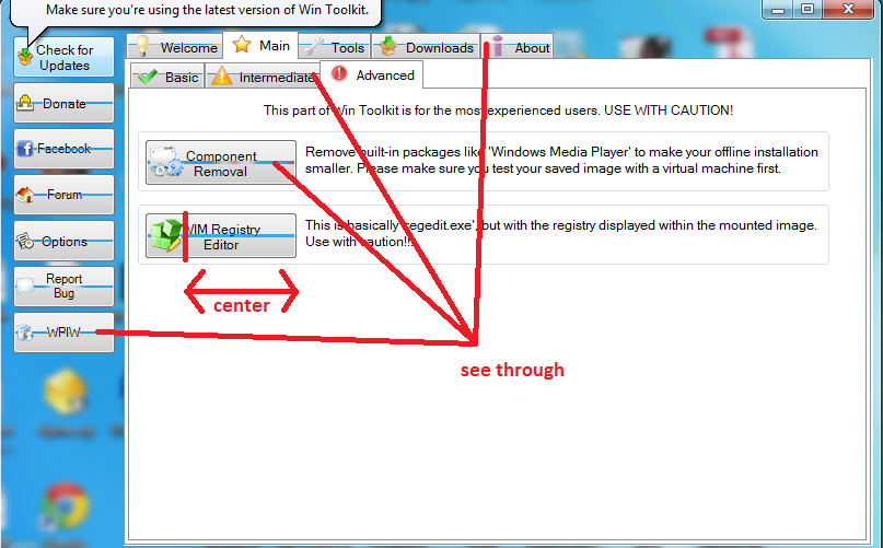
Make the boxes wider to fill the space on right so making tthe edges even, the text could wrap wide not pushing the last word from the sentence to the next line. Make them to split where you want in some cases to look nice. (made some hints) Also you could bold the titles. With Tool Manager Aero enabled clicking on some zones of the window sends it background. Those ugly lines and two shades on buttons are still visible. The WIM Registry Editor button text don't fit on it
-
I still don't know why the buttons looks like are constructed from two zones one top and one bottom with different shades and a little see through window between them. On the menu buttons that are smaller then the rest it looks like a line but on the other buttons becomes thiker and more visible. As I see in any of your screens here isn't visible for you. Thiersee put a screen here where you can see how it looks for him http://www.wincert.n...__60#entry87633 Here is how it looks for me Tweek the text on all buttons to center on the space left on right of the icon or group the icon with the text and center it to button. I marked the WIM Registry Editor button where it's most visible but you can see the differences on the others too. Also you can see the two shades of colour on Check for Updates button that I mentioned.

-
-
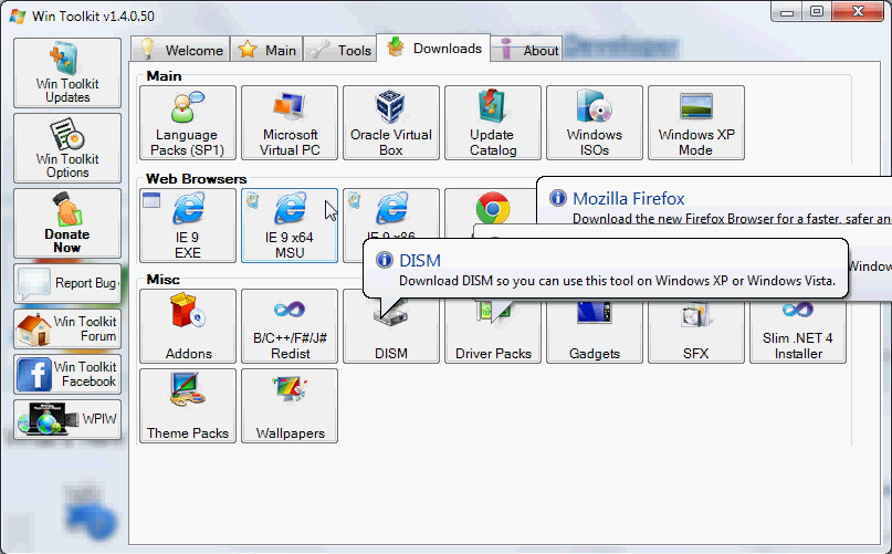
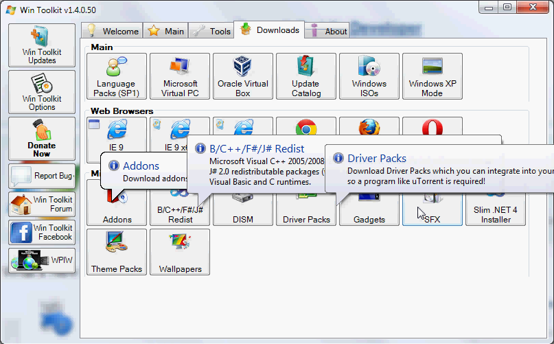
Here's some caps with overlapping tooltips. Not made with the latest Test version but it does the same.


-
I also reported this but seems that Lego can't find a solution for this. http://www.wincert.net/forum/topic/10002-win-toolkit-the-little-things/page__st__20#entry87158
-
The icons and text on buttons should be centered though, eh?
-
Did you make changes in download folder path for McRip Office 2010? Till now all the updates were saved in McRip\McRip Office 2010 Post-SP1 x64\Updates, now with the test version the new updates were saved in McRip\McRip Office 2010 Post-SP1 x64. So I have four new downloaded updates outside the Updates folder. Same for x86.
-
Don't worry, we can understand this. You have your life and visiting your parents is way better than sticking on this forum. Now, :type: :please:
-
-
The extra time display of tooltip when pause the cursor on button is all right but I find annoying the tootips that overlap one each other. When move the cursor from one button to another and crossover multiple buttons in short time there are sometimes two, three or even four tooltips overlaping each other. If you make the tooltip disapear as soon as the cursor leaves the button would be great.
-
You also hidden Office updates... Please look into fix it.
-
You don't need to hide them one at a time. You hide them in block. Ctrl+Click or Shift+Click then and hide them all selected. Sure, if there is a way to implement in WinToolkit to hide all the languages outside the ones that you may actualy want would be a nice option. As for updates, I like to have them all installed, just don't need all the languages.
-
The command lines are from some point back in time when i tinkered with wim images before I discovered this forum. Yes the "copy" command will overwrite the original wim but only at the end after you exported all the indexes you want by repeating the line of export before the final copy. That was what I wanted, to combine x86 with x64 wims and replace the original wim in one command. As OnePiece ponited, now DISM can do a lot more now.
-
imagex /export /check /compress maximum "PATH TO"\install.wim X "PATH TO"\newinstall.wim copy /V /Y "PATH TO"\newinstall.wim "PATH TO"\install.wim erase /F /Q "PATH TO"\newinstall.wim Wanna try this? Repeat imagex line for every index. Replace X with index number.
-
http://www.wincert.net/forum/index.php?/topic/9600-addon-maker/
-
Absolute Windows Toolkit or a combination with Rick's: Absolute WinKit
-
Windows Actually Toolkit Windows Virtually Toolkit
-
Mr_Smartepants knows better that's why is ...Smart... I'm pretty sure Lego will find a way to incorporate all in W7T. With a clear description for what it does each one, a user will decide what's the best solution for him/her.